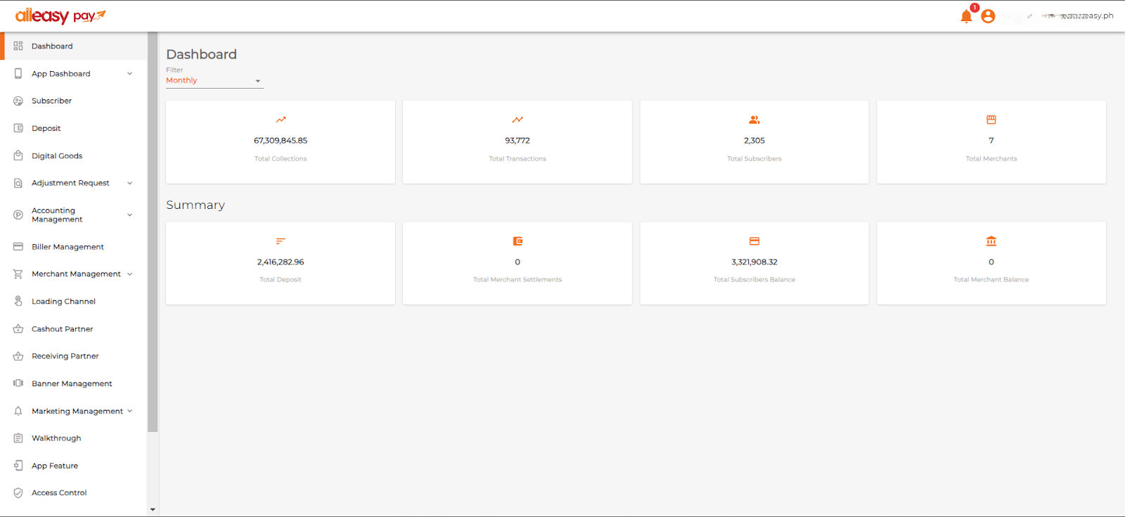
A core app dashboard is a centralized interface that gives teams real-time visibility into the KPIs, workflows, and system signals that drive daily decisions. That can include revenue metrics, support queues, product events, operational alerts, or system health depending on the business.
Dashboards serve different purposes, though. Some are built for reporting on past performance. Others are built for live operations and faster decision-making. And some bring together data from multiple business and technical systems so teams can monitor activity in one place.
This guide focuses on dashboards in that more practical, operational sense: interfaces that help teams monitor the right signals, understand what is happening, and respond quickly. That could mean tracking delivery issues, spotting product friction, managing internal workflows, or giving leadership a real-time view of critical activity.
The right setup depends on what your team actually needs. If you mainly want trend reporting, an off-the-shelf business intelligence tool like Looker or Tableau may be enough. If you need live oversight, role-specific views, alerts, or a dashboard that combines multiple data sources into a single operational view, you likely need a custom-built solution.
This guide will help you understand the difference, decide what kind of dashboard fits your needs, and avoid overbuilding before you have clarity on what you actually need to monitor.
Key Takeaways on Core App Dashboard
- A core app dashboard is best understood as a real-time business dashboard that brings together the most important operational, product, and performance data in one place.
- Real-time dashboards are most useful when teams need to monitor changing data quickly and act on issues as they happen.
- A strong first version should stay focused, with clear KPIs, alerts, filters, role-based views, data freshness indicators, and drill-downs.
- The most effective dashboards do not just display data. They help teams prioritise, investigate, and make better day-to-day decisions.
- Common dashboard mistakes include tracking the wrong metrics, overloading the interface, ignoring user roles, and building on weak data foundations.
- In many cases, the right question is not just what the dashboard should show, but whether you need a custom dashboard or an off-the-shelf tool.
What is a Real-Time Core App Dashboard?
A real-time core app dashboard is a central interface that brings together live operational, product, and performance data in one place. Its job is not just to display numbers, but to help teams monitor health, spot issues early, and respond faster.
Dashboards are tailored to meet specific needs, enabling seamless integration capabilities with third-party services, databases, and cloud platforms. From tracking key metrics to ensuring smooth workflows, they are indispensable for modern businesses looking for a competitive edge.
The next question is whether your team needs real-time visibility or if standard reporting is sufficient.
When a Real-Time Business Dashboard Makes Sense
A real-time dashboard is most valuable when teams need to monitor changing information as it happens and respond quickly. It is not necessary for every workflow, but it becomes much more useful when delayed reporting creates bottlenecks, missed signals, or slower decision-making.
Real-time dashboards often make the most sense in situations like these:
- Live operations: when teams need instant visibility into workflows, service health, throughput, or operational blockers
- Support queues: when response times, ticket volumes, escalations, or service-level targets need close monitoring
- Logistics: when deliveries, inventory, route status, or fulfillment activity change throughout the day
- Sales visibility: when teams need up-to-date tracking for pipeline activity, conversion trends, or revenue performance
- Product or platform monitoring: when product teams need live insight into usage, incidents, uptime, or system performance
In these environments, a real-time dashboard is more than a reporting layer. It becomes a working interface that helps teams prioritise actions, spot issues earlier, and make faster decisions with current data.
What Each Team Needs From the Dashboard
A real-time dashboard should not show the same thing to everyone. Different teams need different levels of visibility, context, and detail.
Operations teams need fast visibility into issues, bottlenecks, delays, and anything that requires action.
Product teams need insight into usage, performance, friction points, and user outcomes.
Leadership teams need a high-level view of trends, risks, costs, and overall performance.
The key is to design the dashboard around the decisions each group needs to make. That makes it easier to decide what belongs in version one and what can wait.
And once you know who the dashboard is for and what each team needs to see, it becomes much easier to assess whether you need a simple dashboard or a more advanced operational one.
fram^’s CORE Dashboard Scorecard
A dashboard only works when the underlying goals, systems, and workflows are mature enough to support it. Before investing in a new reporting layer, teams should assess whether they are actually ready for one. The CORE Dashboard Scorecard helps you evaluate whether you need a basic dashboard, a focused version-one build, or a more advanced custom system.
What CORE stands for
- C — Clarity of goals
- O — Observability needs
- R — Response and oversight
- E — Execution readiness
How to use it
Score each category from 0 to 3.
- 0 = not defined
- 1 = partially defined
- 2 = mostly defined
- 3 = clearly defined and operationally mature
C — Clarity of goals
This measures whether the team knows what the dashboard is supposed to help people see, decide, or improve.
Score 0 if your team has not clearly defined who the dashboard is for or what decisions it should support.
Score 1 if you have a rough idea of the audience and metrics, but no clear priorities.
Score 2 if you have defined users, key metrics, and success thresholds for the first version.
Score 3 if you have clear north star metrics, known decision paths, and strong alignment on what belongs in the dashboard and what does not.
Questions to ask
- Do we know who the dashboard is for?
- Do we know what decisions it should help them make?
- Have we removed vanity metrics?
- Are success thresholds clearly defined?
O — Observability needs
This measures how much system visibility you need beyond high-level reporting.
Score 0 if the dashboard only needs to show basic top-line numbers.
Score 1 if users occasionally need drill-down context.
Score 2 if the team needs incident context, alerts, and issue investigation support.
Score 3 if the dashboard needs logs, traces, step-level diagnostics, or agent trajectory visibility.
Questions to ask
- Do users need more than KPI tracking?
- Do we need drill-down paths from symptom to cause?
- Do we need logs, traces, or diagnostic views?
- Does the dashboard need to support engineering or support workflows?
R — Response and oversight
This measures how much human monitoring, intervention, or escalation the dashboard needs to support.
Score 0 if the dashboard is only for passive viewing.
Score 1 if the team needs simple notifications or alerts.
Score 2 if users need to review issues and act on them.
Score 3 if the dashboard plays an active role in human-in-the-loop review, AI safety oversight, or operational escalation.
Questions to ask
- Do users need to respond to what they see?
- Does the dashboard need approval, escalation, or triage flows?
- Are there safety or quality risks that require human review?
- Do we need visibility into drift, failure patterns, or abnormal behavior?
E — Execution readiness
This measures whether your data, systems, and ownership structure are strong enough to support a reliable dashboard.
Score 0 if the underlying data is inconsistent, ownership is unclear, or system definitions are still unstable.
Score 1 if the foundation exists but requires cleanup.
Score 2 if most core systems and definitions are stable enough for version one.
Score 3 if your APIs, event tracking, ownership, and data definitions are all mature enough to support a dependable dashboard.
Questions to ask
- Are the source systems reliable?
- Are our data definitions consistent?
- Is there clear ownership for the dashboard?
- Can the team trust the numbers they will see?
How to interpret the CORE score
Add your scores across all four categories for a total out of 12.
- 0–3: Not ready yet
Fix the underlying data, ownership, and metric definitions before building a dashboard.
- 4–6: Start narrow
Build a small monitoring dashboard around a few high-value metrics and one user group.
- 7–9: Ready for a role-specific v1 dashboard
You likely have enough clarity and structure to build a focused first version.
- 10–12: Ready for an advanced operational dashboard
Your team is in a good position to invest in a dashboard that supports observability, oversight, and decision-making at scale.
The goal is not to maximize dashboard complexity. It is to match the dashboard to your operational maturity. Teams that score well on clarity, observability, response needs, and execution readiness are far more likely to build a dashboard that people trust and actually use.
When to Build a Custom Dashboard vs Use Off-the-Shelf Tools
A real-time core app dashboard should be chosen based on how much operational visibility, control, and flexibility your team actually needs. Off-the-shelf tools work well when your reporting needs are straightforward and your workflows fit within existing product constraints. Custom dashboards make more sense when you need deeper observability, role-specific views, or action-taking inside the dashboard itself.
Many teams frame this as a budget decision, but that is too simplistic. The better question is: how complex is the environment this dashboard needs to support?
If you only need to display common metrics from clean data sources, an off-the-shelf tool may be enough. If you need to combine business, product, operational, and AI oversight in one place, custom usually becomes easier to justify. Here’s a helpful framework to make this decision:
| Decision factor |
Off-the-shelf is usually enough when… |
Custom is usually the better fit when… |
| Data complexity |
Your data is already centralized, clean, and easy to connect |
Your data comes from multiple systems, has inconsistent definitions, or needs transformation before it is useful |
| User needs |
Most users can work from the same dashboard layout |
Different teams need different views, permissions, and workflows |
| Observability depth |
You mainly need KPI tracking and alerts |
You need logs, traces, root-cause analysis, or step-level diagnostics |
| AI oversight |
AI monitoring is light or still experimental |
You need human review, trajectory analysis, safety checks, or drift monitoring |
| Workflow integration |
The dashboard only needs to display information |
Users need to take action from the dashboard, escalate issues, or trigger processes |
| Speed vs flexibility |
You need something live quickly and can accept platform constraints |
You need the dashboard to reflect your exact operating model |
| Long-term scalability |
Reporting needs are unlikely to change much |
The dashboard will evolve with the product, team structure, or AI capabilities |
In general, off-the-shelf is the better fit if:
- Your data is already clean and centralized
- Most users need similar views
- You mainly need KPI reporting and basic alerts
- Speed matters more than precision customization
A hybrid approach is often best if:
- You need a standard BI or monitoring layer plus a few custom workflows
- Different teams need different views, but not a fully bespoke platform
- You want to move quickly without locking yourself into vendor limitations
Custom is usually justified if:
- You need role-based workflows and permissions
- Observability and diagnostics are core requirements
- The dashboard must support action-taking, not just reporting
- AI oversight, tracing, or intervention are part of the workflow
The key is not whether custom sounds more advanced. It is whether your dashboard needs to act as a simple reporting surface or a true operational control layer. The more your team relies on role-based visibility, observability, and intervention workflows, the stronger the custom case becomes.
What to Include in Version One — and What It Should Help Teams Do
The first version of a real-time business dashboard does not need to do everything at once. It should focus on the elements that help the right teams monitor what matters, respond quickly, and make better day-to-day decisions.
A strong version one usually includes clear KPIs, alerts, filters, role-based views, data freshness indicators, and drill-downs. The value of these elements is not just that they display information, but that they help teams understand what is happening and what to do next.
Create a shared view of what matters
A good dashboard should bring the most important operational, product, or performance signals into one place. That usually starts with a small set of core KPIs tied to the outcomes the dashboard is meant to support.
The goal is to reduce the need to check multiple systems and give teams a clearer shared view of current performance (think Power BI). For many teams, that alone makes day-to-day work faster and more aligned.
Help teams respond faster
Real-time visibility matters most when it shortens the gap between noticing an issue and acting on it. This is where alerts and clear status indicators become especially useful.
A strong version one should make it easy to spot spikes, drops, delays, failed processes, or other issues that need immediate attention. If the dashboard cannot help users respond faster, the real-time layer is much less valuable.
Support better day-to-day decisions
The dashboard should help users make informed decisions without overwhelming them. Filters make this easier by letting users narrow the view by team, timeframe, location, workflow, or another relevant variable.
This gives teams more context and makes the dashboard more useful across different situations. Rather than showing the same static view to everyone, the dashboard becomes a more practical decision tool.
Adapt to different users and workflows
Different teams need different levels of visibility. Leadership may need a high-level summary, while operations, support, or product teams may need more detailed views.
That is why role-based views are so important in version one. They help each user see the level of detail, context, and workflow visibility that is most useful to them, instead of forcing one generic dashboard on everyone.
Make the investigation easier
A dashboard should not stop at showing summary metrics. Users also need a way to understand what is driving a spike, drop, delay, or failure.
Drill-downs are essential here. They let users move from a top-line signal into the detail behind it, which makes the dashboard more useful for investigation and root-cause analysis, not just surface-level monitoring.
Build trust in the data
A dashboard only works if users trust what they are seeing. Data freshness indicators help users understand how current the information is, especially when the dashboard depends on multiple systems or live feeds.
Trust also comes from clear definitions, reliable integrations, and the right access controls. Even a well-designed dashboard becomes far less useful when users are unsure whether the numbers are accurate or up to date.
The goal of version one is not to build the most advanced dashboard possible. It is to create a focused, usable dashboard that gives the right people timely visibility into the metrics and workflows that matter most.
Common Mistakes to Avoid
A real-time business dashboard can be powerful, but only if it is built on the right foundation. Many dashboard projects fall short not because the interface looks bad, but because the team tracks the wrong metrics, overloads the user with information, or treats observability as something to add later.
And even a well-designed dashboard can become less useful if it is built on the wrong assumptions. So, here are the common mistakes to avoid when planning a real-time business dashboard:
| Common mistake |
Why it causes problems |
What to do instead |
| Tracking the wrong metrics |
A dashboard is only as useful as the metrics it highlights. If teams focus on vanity metrics or easy-to-measure outputs instead of indicators that reflect performance, stability, or business value, the dashboard can create false confidence instead of better decisions. |
Focus on metrics that reflect real business, operational, or product outcomes. Prioritise signals that help teams monitor health, spot issues early, and take action. |
| Trying to build on messy data |
Real-time visibility does not help if the underlying data is inconsistent, delayed, or poorly structured. Weak data sources and unclear definitions quickly undermine trust in the dashboard. |
Validate your data sources, definitions, and integrations before building the interface. A dashboard is only as reliable as the data behind it. |
| Overloading the interface |
When a dashboard includes too many widgets, too much text, or too many competing signals, users struggle to see what matters and what action to take. |
Keep the first version focused. Show the most important metrics clearly and avoid adding extra elements unless they support a real user need. |
| Ignoring the user’s role |
Different users need different levels of visibility. A dashboard that treats leadership, operations, support, and product teams the same often becomes less useful for everyone. |
Design views around user roles. Give each team the level of detail, context, and visibility they need to make decisions. |
| Treating observability as an afterthought |
A strong dashboard should not only show performance metrics, but also help teams understand failures, delays, anomalies, and system health. Without that, it becomes a surface-level reporting tool. |
Build in visibility into health, incidents, bottlenecks, and abnormal behaviour from the start so teams can investigate, not just monitor. |
| Failing to account for change over time |
A dashboard that only shows the current state can miss drift, emerging issues, and longer-term changes in behaviour or performance. |
Include trend views, comparisons, and historical context so users can spot gradual changes as well as immediate issues. |
| Making investigation too hard |
High-level metrics are useful, but they are not enough on their own. If users cannot drill into the causes behind a spike, drop, delay, or failure, the dashboard becomes a reporting layer instead of a working tool. |
Add drill-downs, filters, and supporting detail that help users move from summary metrics into root-cause investigation. |
| Skipping human escalation paths |
In more complex or AI-assisted workflows, dashboards should make it clear when a human needs to step in. Without a clear escalation path, teams may rely too heavily on incomplete or ambiguous signals. |
Make escalation paths visible. Show when human review is needed and make it easy for users to move from monitoring into action. |
The best dashboards stay focused, trustworthy, and action-oriented. They do not try to show everything at once – they help the right users understand what is happening and what to do next.
How We Build Custom Core App Dashboards for Clients
Building a custom core app dashboard starts with understanding who needs the dashboard, what decisions it should support, and how fresh the underlying data needs to be. The goal is not to display as many metrics as possible. It is to give the right users clear visibility into the parts of the system they need to monitor and act on.
The best way to understand what a core app dashboard looks like in practice is to look at a real delivery example.
Quick Case Study: GoUpscale
Fram^ built GoUpscale as a multi-platform product spanning iOS and Android apps, web portals, and a multi-tenancy dashboard. The dashboard manages users, tenants, and custom configurations across the entire system.
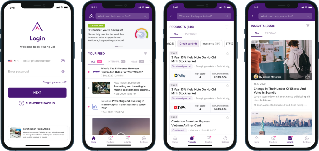
The project covered UI/UX design, testing, scalable architecture, deployment to both app stores, and ongoing feature work. The core dashboard functions as part of the operational product itself, handling live configurations and tenant management rather than just displaying reports.
You can read the full GoUpscale case study here.
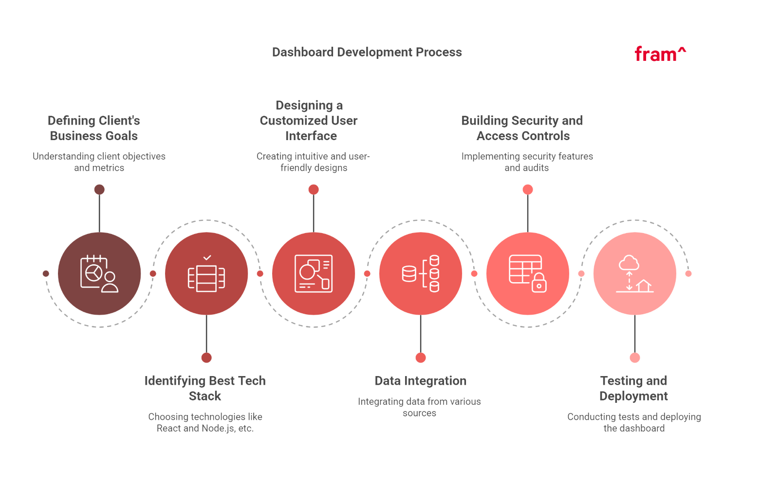
Here are the critical steps Fram^ followed to successfully develop dashboards for clients:
Step 1. Defining Client’s Business Goals
We begin by understanding the client’s objectives, identifying the critical metrics they need to monitor, and determining how the dashboard would enhance their business performance.
For example, for a retail client, we focused on sales performance, inventory levels, and customer engagement, ensuring the dashboard provided real-time insights that helped optimize inventory management and boost sales.
Step 2. Identifying the Best Tech Stack
Choosing the right technologies is vital. That’s why we often use React for the front end and Node.js for the back end as they enable fast, scalable, and dynamic user interfaces while providing a robust and secure server environment.
Step 3. Designing a Customized User Interface
A clean, intuitive, and user-friendly design ensures efficient navigation and a seamless user experience.
Fram^ emphasizes user feedback during the design process to optimize user engagement and trust.
For instance, for a finance client, we integrated interactive charts and data filters, allowing users to easily track financial performance and adjust views based on specific criteria.
Step 4. Data Integration
We integrated data from relational databases, cloud services, and external APIs to centralize vast amounts of information. Real-time data integration ensures the client always has access to the most current insights.
Fram^ used Zapier for automating data transfers and API connections because it allows seamless synchronization between various platforms and ensures data is updated instantly.
Step 5: Building Security and Access Controls
Robust security features, including authorized user roles and regular security audits, were implemented to protect sensitive information and maintain accountability.
For example, we implemented role-based access control (RBAC), ensuring that only authorized users could access specific datasets, and performed routine security audits to identify vulnerabilities.
Step 6: Testing and Deployment
Automated testing tools ensured the dashboard was bug-free and optimized for performance. We deployed the final product on a cloud-native platform to ensure the app’s performance was scalable and reliable.
For this, we used Selenium for automated unit testing because it allows for efficient testing of both front-end and back-end components, ensuring a seamless user experience before deployment. (Learn more about testing in our guide about performance testing types)
Build Your Core App Dashboard with Fram^ Today
Developing a core app dashboard tailored to your business’s unique needs can revolutionize how you manage data, monitor performance, and make decisions. At Fram^, we specialize in designing and developing dashboards with powerful tools, seamless integration, and advanced features to enhance your business operations.
Get in touch with Fram^ today to discuss your requirements, and let us help you build a dynamic, user-friendly core app dashboard that drives success. Contact us now!